GUNPOINT
A stealth puzzle game that lets you rewire its levels to trick people.
Mailing List
Find out when we release a new game, and get invited to closed beta tests.

Sign up here
Release
Out now! $10!
Platform
Windows, Mac and Linux.
Problems?
Tell us about it! Literally do tell us about it, or nothing will happen.
Yes, You Can Monetise Videos You Make Of This Game
Here's the formal permission bit.
Other Projects
Here's a page about what else I'm working on and what else I've done.
Team
Design/Code/Words
Character/Level Art
Background Art
Mission Music
Title Music
Menu Music
Theme
By Tom Francis. Uses Adaptive Images by Matt Wilcox.
Gunpoint’s Possible Art Styles
It’s humbling and overwhelming to have a bunch of talented people throw stuff at you. Content-wise, I mean. I’ll stop gushing about it now, though, and just show you the best of what I’ve seen. Sorry to anyone who submitted stuff that isn’t featured here – I have the enviable problem that to feature everything would actually grind development on the game to a halt, so I’ve had to be more ruthless than I’d like. I’ll split this into Character art and Setting concepts.
Characters
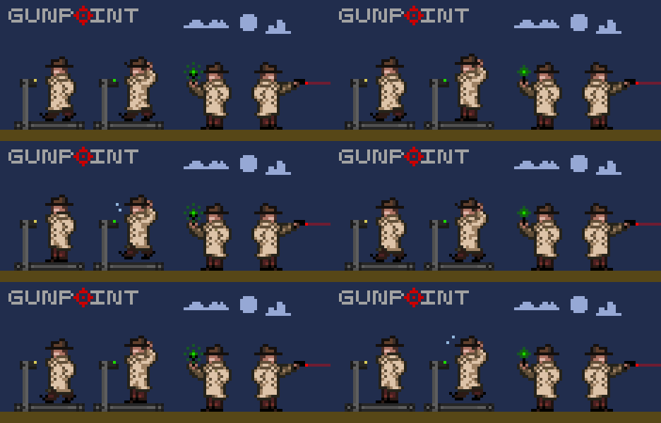
EthZee’s main character mockup is exactly what I was hoping to get – something not a million miles from what I’ve got, but correctly proportioned, nicely shaded, and animated. I love that he used treadmills to explain why the walking and running animations stay on the spot.
Michael’s stuff is amazing. It puts me in mind of some sublimely quirky French adventure, full of excitingly atypical characters. I tried to see a way it could gel with the mood and feel of what I have in mind for Gunpoint, but I couldn’t. I really hope he can use this guy, and the others he made in a similar style, in a future game.
I particularly love Teck’s second take on the hero. It’s based on a sprite he did of Mal Reynolds from Firefly, and it’s awesome that even at this resolution, you can kind of tell.
I am scared of this. Definitely one of the most original takes on what the character could be.
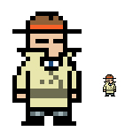
Dan, an artist at Bizarre Creations until they went under, did the awesome sprite above in the comments here just for fun. He can’t actually do the art for Gunpoint since he’s busy applying for jobs, but he had a go at reducing it down to the 24px size of Gunpoint’s other characters anyway, and it’s somehow even cuter.

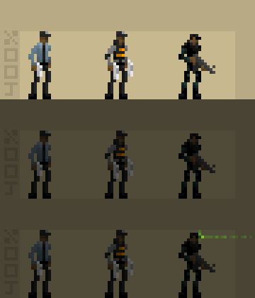
The sprite above is the first thing John sent, his take on the ‘professional killer’ enemy type with an android twist (I hadn’t set out my full specs for the setting at the time). It’s one of the rare pieces of art that, even in isolation, just makes me think “Holy fuck I want to play that game.” I’d be this guy, I’d fight this guy, I don’t care, I just want to be playing around in a world with things like that. The guys below that are what the more conventional guards would look like: lean, capable, cool.
Eric’s a professional who’s worked on a lot of big licenses, which might explain why his version of the player character does such a perfect job of capturing what I was trying to do with my original art. I tried to do something cartoony in style without being silly, and that’s exactly what he’s pulled off.
If there’s ever a Nintendo DS version of Gunpoint, this is definitely what it should look like. I like the cleaness.
A great character, a little smarter than the Columbo-like slob I was imagining. I can picture him jabbing someone with his umbrella to release a slow-acting poison, and that’s a quality I like in a sprite.
Setting
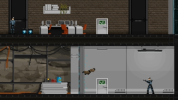
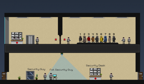
Great to see a complete take on it – some of the things I don’t like about my placeholder stuff, like the beige walls, actually look fine once there’s some well-drawn detail in there. Glass-backed elevator is a cool idea.
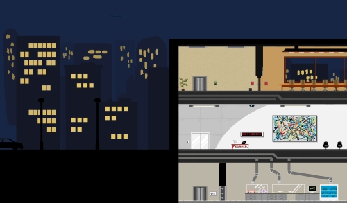
A nice selection of interesting environment types here – I think big windows facing out onto the city are a must, and I really dig the giant Pollock in the modern-looking office below.
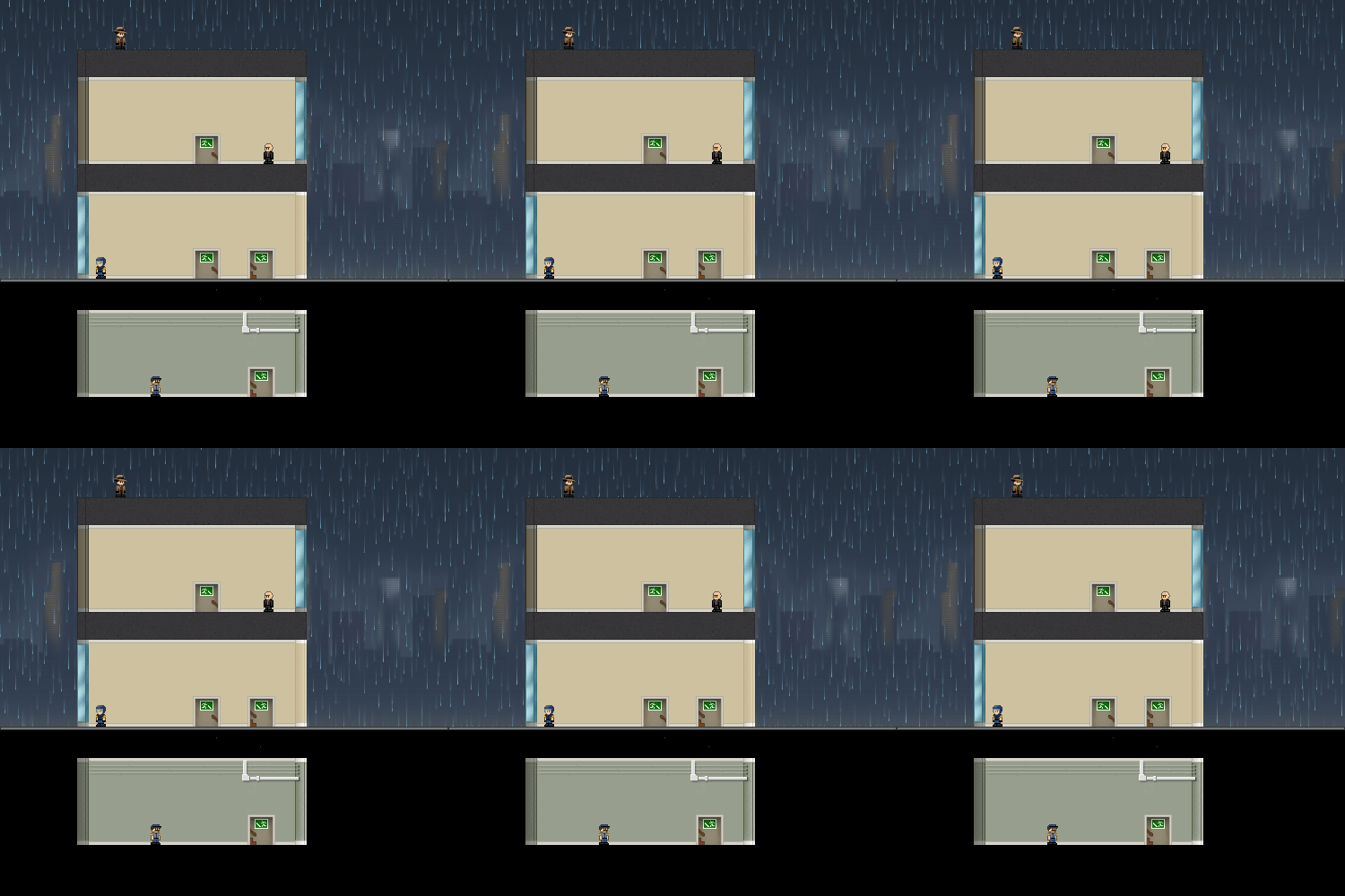
This is about as clean, clear and cute as the game could possibly get – I don’t have to magnify it, or even really open my eyes, to see every detail. The cityscape is lovely, as is the sparkly rain, and the whole thing has a nice cohesiveness. I can’t quite figure out if the mood of the game would clash with just how adorable these guys are.
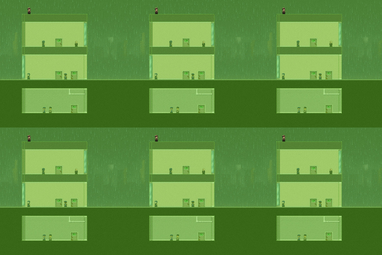
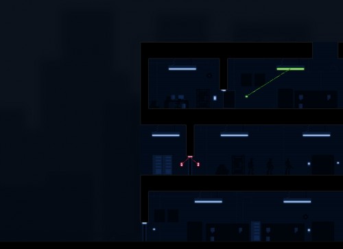
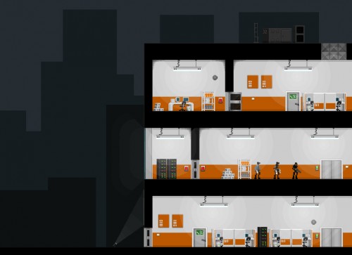
If you ask John (who did the awesome trenchcoated android) if he’s interested in doing any environment art, this is what you get back the next day. It looks like a finished game. An amazing amount of detail – the cleanness and bursts of colour remind me simultaneously of Aperture Science and Mirror’s Edge, which is sort of saying something. Click through for the bigger versions of these. The Crosslink mode is so much cooler than the way I imagined it, making it something you’d be excited to switch to rather than an ugly but necessary mess.
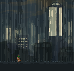
Such an amazing city backdrop. Has the gloomy, ominous mood I was going for, but is also just slightly futuristic and strange – these tall lit towers are unusual architecturally, and it gives the place an intriguing atmosphere that makes you want to explore it. I’m so set on rain being a big part of the atmosphere on some levels that I’ve been thinking of having varying strengths of it – it’s such an easy win on the audio side, and if heavy rain can look this cool, it’s definitely worth it.
Despite the ridiculous level of talent here, I’m pretty close to a decision. I’m just waiting on a couple of samples to see how certain styles work with certain elements, and I’ll know once those are in.
In the end, it’s come down to style much more than quality – quality just isn’t an issue when so many are so good. Any of these styles would make an awesome looking game, so I just have to go with whoever happens to click with the style and tone of the aspects of the game I’m doing on my end.
More Gunpoint
This does mean I expect an “The Art of Gunpoint” book in the Collector’s Edition of the inevitable Retail version of the game. No wait, DEMAND.
Jonas:
Oh man John Roberts’ environment concept is amazing! You’re not using that? I feel like I should make a pixel art game now so I can hire him.
radomaj:
All of these are impressive, don’t get me wrong, but there is really only one choice. You have to work with John Roberts. I’m in love with his concept art. (No, I’m not going to marry it, it’s not interested in me)
Jonas; no! These aren’t just the ones I’m not using, it’s all of my favourites.
Marc:
Wooo. I see your problem here Tom, you could easily use any of the above. For my money I love Eric Heitman’s capture of the character you designed, the mysterious magicka style black face would be a great match for Gunpoint.
I do love John Roberts and Beldaks attempts but I can’t help but think they might be at odds with the gameplay. Rewiring door switches so bads trap themselves in rooms is rather light hearted when compared to those 2 art styles.
I’d use John, he’s filled out the world you’ve made brilliantly.
Goddamn it, Michael Hussinger squeezed more character into those six frames than I could ever manage, even with Jim Carrey and a MASSIVE vice. What are you using to animate? Photoshop/bridge is giving me a headache.
radomaj:
John Roberts is JohnArr? Of the RPS-Podcast-“John, AAAAaargh!” “fame”?
Totally dig John Roberts’ style, in my view that’s like the ideal direction the game could be headed in.
@radomaj I make pixels, questions and sandwiches. If there was an internet showcase for the noble art of bread-filling I would be triple “famous”.
I think it’s essential that he holds his hat when he jumps like in Heitmans art. That is all.
VelvetFistIronGlove:
John Roberts’s version reminds me strongly of the agents in the Milkman’s world in Psychonauts.
Karl:
I love John’s environment. I can’t wait to see how the game turns out.
Ezzer:
Really fantastic stuff! That last one gives me a serious artboner.
Could any of you incredibly talented artists let me know if there’s a decent spriting program floating around somewhere? I’m not really looking for anything too fancy, Something that’s basically MSPaint + transparency + layers + animation would be perfect.
Chris:
Thanks for including me up there, it was my first time trying to do pixel art, so it makes me feel all warm and gooey inside. My one was definitely retro.
The looseness of Beldak’s background helps to push out the foreground. I’d love to see some animated layers to the background (I think it’s called parallax) where the furthest buildings would seem to move more slowly into view than the close ones.
I can’t believe how Dan managed to shrink his character down and have it still extremely clear.
I’d vote for John too if only for the speed in which he can work at.
Chris:
Whoa I just clicked on Michael’s stuff, the fat dude with a monobrow and moustache with a drink in his hand is just exceptional.
The Cheshire Cat:
Are you planning on mixing and matching or focusing on one artist? Because I think it would work great if you used Beldak’s backdrop + rain with John’s foreground and character art.
Graeme Moralee’s rain on Beldak’s city, with John Roberts’ everything else would be super awesome.
@Ezzer – Check out Graphics Gale (it has a free version which does most everything you need) and ProMotion. They are the 2 big names in pixel art.
Jason L:
Some of them do have the advantage of being race – and semi-gender-neutral. It seems to be becoming a bigger cultural criterion, if you feel like being ahead of curves.
Postal:
So much truly great art there. Love the animated rain, please keep it along with the guy holding his hat while he jumps.
So of course I must complain and criticize the work I could never do.
Please keep the main character gender neutral. Or as long as its vague enough, doesn’t even need to be a proven human, just as long as its the shadowy figure.
Now for a horribly stupid idea you should ignore, what about changing art styles for different parts of the game. Perhaps even let the art get more complex as you get farther into the game. Nah, I’ll shut up now.
Oh my goodness, the spirits which hang onto their hats as they run fill me with glee.
Thanqol:
You absolutely, absolutely must use Beldak’s design. The others are fantastic, especially John Roberts’, but that one is the game I want to play.
Curt:
wow, i mean just…wow. Obviously you have some friggin hard hard calls to make here. I def vote for john’s environment, just amazing and even if you said it took him a month I would still be pretty stunned. As far as the character I can’t decide, you are right the environment and the character are so interdependent that you really have to take time figuring it out. As I said before I am no game designer, I just have had some clients ask for it. But I would be more that willing to provide any help you need on this, even if it is just me making little 8 pixel potted plants, or a logo, or even help with a launch site or banners and such, I am in. Thanks for the nod btw :)
Jackrabbit:
Those are all just astonishing. John wins for me for the aforementioned Mirror’s Edgeness but they’re all just so ridiculously good. You lucky sod.
Phydaux:
All of these are great. I don’t think you could go wrong if you picked any of them.
Beldak:
Hey there!
These are some astonishing entries and I’m quite proud to be amongst them. I’ve been trying to get more work done on my take on office buildings and backgrounds, as these characters are simply to strong for me to compete against (My favourites are John’s and both Michael Hodkinson and Hussinger’s)
Unfortunately these backgrounds have been taking longer than expected. This due to deadlines, my internet at home having been disconnected for over a week and some other issues. But also that it’s really quite hard! I’ve really been struggling to get the Mirror -edgey feel coupled with a sort of dark and a bit dirty noir feeling.
Because I don’t want to delay further I’ll post my work in progress building. Although this one features purple, the buildings would all feature a different colour theme and would appear to be quite modern (It’s hard to come up with neat looking ‘modern’ architecture if you’re not an architect by the way o.o.) However, for all their fanciness, these buildings are dusty, dirty and rusty in the corners. They ought to make you feel unpleasant.
http://student-kmt.hku.nl/~fabian1/beldak/random-office.png
I also wanted to keep a certain.. rough.. paintery style. However, it’s way overfeatured here.. as I didn’t get to much refining yet. Anyway, I hope you all like it! I’ll leave it at this for now and start a new building.. But I hope Tom can make a choice regarding my work with what I’ve posted thus far.
Chris:
The highlights for me are the portrait and glowy plants. The colour choice is pretty bodacious too.
JohnArr, I’m using GraphicsGale, which is just a fancied-up equivalent to MSPaint with animation features.
Any pixel editor will do for spriting, and if you’re not animating, even MSPaint isn’t half bad.
If anyone hass more interesting alternatives other than GraphicsGale/ProMotion, I’d happy to hear them.
And thanks to the people who liked my stuff! I have some difficulties with neutral, “realistic” settings and wanted to suggest another direction (think Peter Sellers in “The Party” meets Ghost Trick, but eh :)
pireninjacolass:
I wish I knew you were requesting art, I would have given it a shot.
nUggEt:
John Roberts FTW
pizza:
Good work all round but John Roberts and Beldaks work are both outstanding.
Really can’t wait to play it if the game looks like either of those.
Hi Tom,
I’ve been following your indie project since it was posted on Rock Paper Shotgun, it looks extremely fun and clearly you’re now spoilt for choice with art styles :)
I was wondering whether you’ve been considering music for your game. If you are I’d love to see if I could come up with anything good. Obviously it would be completely up to you whether or not you’d use it, I would merely be grateful for the challenge.
Some of my music is up @ http://www.clockworkpeanut.com/index.php/my-music/
I have delved into theme music in the past, but obviously none of the stuff there up on my website is of that nature.
GraemeMor:
Finally got some time to get an animation done..
http://graememor.deviantart.com/art/Gunpoint-player-run-204487237
Also animating in Photoshop is okay once you get your head around it.
Lobo:
Thanks for the feature. I had so much fun doing this. :)
I also just wanted to say well done to everyone. I think all this work is amazing and inspiring stuff, and whatever happens, Gunpoint is going to look great! :)
verendus:
personally? roberts’ enemies and buildings, beldak’s backdrops, and Heitman’s protagonist.
TomBombadil:
I Honestly can’t wait to play this game. I knew from the first post about it, that I would love it, and it just keeps getting better and better. I also have to agree with verendus: Roberts buildings, Beldak’s backdrops, and either Heitman’s or Teck Lee Tan’s protagonist
Jibs Monteef:
Seconding, thirding, fourthing, nthing the request for the Roberts/Beldak mashup – that looks utterly phenomenal. The rest of the entries are fantastic as well, but holy crap you guys made a 2D Mirror’s Edge with incredible Blade Runner backgrounds. I must play this.
barley:
I’m loving this so far, and all the art styles look great. The only thing I could possibly suggest to make this better is regarding the links between switches/lights/doors etc. when using the crosslink. It could look more like electrical wiring if instead of having it be diagonal lines straight between them, you had them as sort of right angled wiring thingies like you’d get on a wiring diagram (e.g. http://schematicwiring.com/wp-content/uploads/2010/10/Honda-CB500-Electrical-wiring-diagram.jpg).
If you get what I mean.
Yeah, I had the same thought and I actually had it working like that at one point. First problem is that it makes it much more likely for wires to run along the exact same path, making it hard to tell between them. Tried to fix that by making them come out and corner at slightly irregular offsets, but it just made even quite simple circuits look terrifyingly complex and hard to read. So I gave up and went back to the simple way.
If I can figure it out, I’d like to have them drooping slightly between the two devices, to get some curves in there and make it look a little more stylised.
Anonymous:
You’ve probably done it already, let alone figured it out, but I had a few minutes to kill. Options for approximating a catenary (presumably the polynomial would be fine): http://www.tinaja.com/glib/bezcat.pdf and drawing filled/textured Beziers in Gamemaker: http://gmc.yoyogames.com/index.php?showtopic=395832
GraemeMor:
Here is a sample of the armoured guard taking out the player..
http://graememor.deviantart.com/#/d3dw9ny
sQUEAKYfOAMpEANUT:
Beldak and Mr. Hussinger’s submissions are gorgeous. I’d love to play a game with art styles like that. I wish I was half-way decent at spriting so I could make you something, Tom.
Urthman:
I don’t suppose there’s any way for you to pull a Super Meat Boy and use several of these?
Nonomu198:
I like Beldak’s. Looks like a game you never get timed of playing. Random lightning to scare the crap out of you when trying to murder some baddies. Yah.
Tentaculat:
Very very nice work on the game. You /are/ a programmer, the tools and language used are irrelevant – doesn’t have to be written in C++ to be something worth playing.
EthZee:
Man, cheers for featuring mine. Sorry I never got back to you; I started a job soon after I did that so my free time is way more limited now. I’m glad you liked it, though, and I definitely love the styles you picked; John Robert’s characters are sweet as anything.
This game is bound to be excellent.
Jeu : Gunpoint, infiltration et défenestration (Windows, Linux, Mac) | 16 Couleurs:
[…] blog de l’auteur relate le développement du jeu et mérite le coup d’œil, comme ce billet qui présente les différentes options alors envisagées pour les […]


