GUNPOINT
A stealth puzzle game that lets you rewire its levels to trick people.
Mailing List
Find out when we release a new game, and get invited to closed beta tests.

Sign up here
Release
Out now! $10!
Platform
Windows, Mac and Linux.
Problems?
Tell us about it! Literally do tell us about it, or nothing will happen.
Yes, You Can Monetise Videos You Make Of This Game
Here's the formal permission bit.
Other Projects
Here's a page about what else I'm working on and what else I've done.
Team
Design/Code/Words
Character/Level Art
Background Art
Mission Music
Title Music
Menu Music
Theme
By Tom Francis. Uses Adaptive Images by Matt Wilcox.

A Snoop At Gunpoint’s Labs
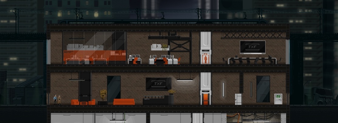
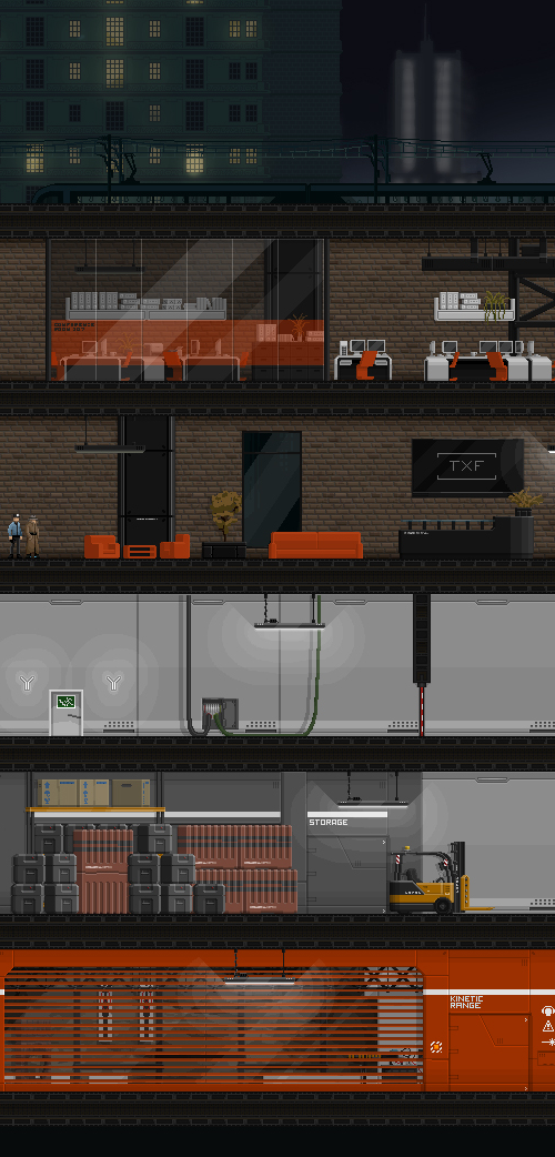
Last week I added two new gadgets to Gunpoint and added test levels for eight of them, to give you a custom-built space to try them out and learn how they work. At the same time, coincidentally, John finished the level art for the labs of the company who make these things. I wanted them to have functional-but-trendy offices above ground, and straight up supervillain labs beneath. The stuff he’s actually produced is way cooler than I’d imagined. Click this for big:
There’s loads more to this tileset than shown here, too – you could make a massive level where each floor has its own colour motif, like some of the offices in Mirror’s Edge. I like any time the art for our game naturally makes me mention Mirror’s Edge. Long story short, I’m now trying to find excuses to set more levels in labs.
By the way, I’ve started properly updating the Gunpoint Facebook page the same way I do with the Twitter account, so follow whichever you prefer up in the top right if you want to keep tabs on it.
DT:
That looks incredible.
Tom:
Looking marvellous, sir. Can’t wait to play :)
lookin’ real great :)
dtzortzis42:
It is looking great! :)
Where’s that FB page btw?
Jim:
I am really excited for this game! incredible work. :D
Cheers. Here! http://www.facebook.com/GunpointGame
Carson:
When will test be sent out out please send it to me!!
Aweomse
Sly:
Love it! Also, MORE Mirror’s Edge inspired offices, labs, subways, sewers, towers, and did I mention roofs – please :)
Awesome can’t wait to be able to play this!
(FYI: the elevators in the image appear to be *slightly* misaligned!)
Seriously awesome :)
Jay:
Yes! ORANGE equals SCIENCE!!
Nonomu198:
Please don’t mess around with the Last Comments box, Tom. I panicked there for a second. It is this blog’s prime feature. And I need it in the right side of my monitor.
This is how nature intended for it to be, Tom! Don’t argue with natural alignment of the boxes!! You will anger the gods!!!
joxp:
First things first, Nonomu198, having it on the bottom is more sleek. To darkblackcorner, Those elevators don’t connect, the Stairs doors on the right and left sides do. I doubt this will be seen by them. And It would be VERY nice for a new release to be… released! For all of us who couldn’t sign up at the right time do to replacement computer parts taking ages to come.
David:
Now, I hate to be -that guy- but do you know when you may be releasing another build?


