TOM FRANCIS
REGRETS THIS ALREADY
Hello! I'm Tom. I'm a game designer, writer, and programmer on Gunpoint, Heat Signature, and Tactical Breach Wizards. Here's some more info on all the games I've worked on, here are the videos I make on YouTube, and here are two short stories I wrote for the Machine of Death collections.
Theme
By me. Uses Adaptive Images by Matt Wilcox.
Search

Welcome To Site 7
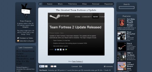
Look, I changed everything! I usually redesign my blog a bit at the start of every year, but this one is the first time I’ve built a completely new one from scratch in more than eight years. As is now tradition, I’ll give you a song to listen to while you snoop around.
It’s been like that for two years, and there were a six things I wanted to change:
1. A title
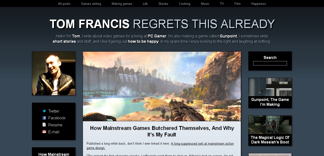
I’ve always struggled with this – I like to be clear and descriptive, but most personal blog titles make me cringe. I also have a bad name for possessive apostrophes, so “Tom Francis’s Blog” is just painful. I used to avoid the issue by naming it something completely irrelevant, like ‘Ugly Fruit’ or at one point ‘Politics’. Then I avoided it by removing the name completely, so the last few iterations have had no title at all.
This time, I was determined to have one even if I immediately regretted it. After trying several I immediately regretted, I gave up and left it as the placeholder: “Tom Francis Regrets This Already”. I still regretted it, but neatly, the more I regretted it the more appropriate it became.
2. An intro
I looked at a lot of people’s personal sites to figure out how to improve mine, and it’s weird how many of them don’t explain who the hell the person is until you rummage around. In the spirit of explaining things to assholes, I really wanted to do a better job of that. The previous site did it in a few terse, reluctant words, so I tried to make it a bit friendlier this time.
I also think a lot of us are still under the impression that the ‘home page’ is where people arrive, and then they delve into the ‘post pages’ from there. In reality, most people discover sites when they’re linked to a particular page, so they’re more likely to see a particular post first. That’s why the new intro’s on every page.
3. Responsive design
Literally more than half of internet users are browsing from a mobile device now. And they vary wildly in resolution. I’ve never liked fixed-width designs, and I’ve never had one here, but previous versions all needed a resolution of at least 1024 pixels wide. They were basically useless on mobile phones.
Rather than make a separate mobile version, which’d scale badly to the huge middle ground between a Retina iMac and a first-gen smartphone, I’ve made the whole design resolution-agnostic. Try resizing the browser window – it should adapt all the way down to about 250 pixels wide, so it should be readable and usable on anything beyond a scientific calculator.
I’m also using Matt Wilcox’s Adaptive Images code to automatically resize images to your screen width before you download them, so smaller-res devices don’t download unnecessarily big images.
4. Bigger images
At the other end of the scale, it’s ridiculous how many sites look awful at 1920×1080. That’s by far the most common resolution now, and the internet at that res is a sad ocean of wasted space around unreadable text. I wanted to make sure everything expanded at high resolutions, and I particularly wanted big, sharp, colourful images. Most of the games I write about are gorgeous, and it always makes me sad to see them relegated to little thumbnails.
5. More featured posts
Previous designs did have a column for posts I wanted to highlight, but it was a clumsy JavaScript array I had to manually text-edit every time I wanted to add something new. So I never did. This time, I wanted those to be bold, colourful little badges, with clearer titles, and a much easier way to add to them. I can just add a tag to any post to add it to the rotation there, so I’ll be expanding that set as we go. You can also read all 30 with the link at the bottom of the right column.
6. Ways to subscribe
I realise not everyone uses an RSS reader – even Google, who make the best one, are basically abandoning it. I’m still keeping it, but I’ve now set up a Facebook page and a Twitter account that only ever post when I publish something here.
I think that’s it! Big thanks to Westley Knight, Jenn Frank and Graham Smith for testing and help. As ever, let me know in the comments if anything’s broken. If anyone’s interested in the stats, we’ve just passed 26,000 comments, this is roughly the 600th post (I deleted a few), and so far 1.4 million people have been here. Wow.
More Site Stuff
