TOM FRANCIS
REGRETS THIS ALREADY
Hello! I'm Tom. I'm a game designer, writer, and programmer on Gunpoint, Heat Signature, and Tactical Breach Wizards. Here's some more info on all the games I've worked on, here are the videos I make on YouTube, and here are two short stories I wrote for the Machine of Death collections.
Theme
By me. Uses Adaptive Images by Matt Wilcox.
Search
Gunpoint Delayed To… I Don’t Know, Christmas?
Game release dates should probably be phrased as “I don’t yet know why the game won’t be ready in July.” I’m changing this for Gunpoint to “I don’t yet know why the game won’t be ready by Christmas.”
It’s going well now, actually. But here are the two things I didn’t know when I predicted July:
- Rewriting the collision system, which I had planned for, would take an amount of time I had not planned for. It would also send me quietly mad on Twitter.
- Integrating new art and animation, which I had planned for, leaves the game pretty much unplayable until it’s done. This, I hadn’t planned for.
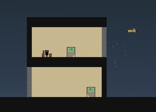
2 means I can’t make much progress on the game’s levels while John is still working on the character art, because you can’t make what you can’t play. He’s burning through it super fast, though, and it’s starting to look awesome in-game. The player character, Conway, has just the right mix of super-spy suave and silliness. Here’s one of my favourite animations for him so far:

All the basic movements are already done for the player character, so all I really need is for one guard type to be jumpable-on and punchable-in-the-face. That’ll be enough to make actual levels that work, even if a lot of the poses and sprites are placeholder. As before, I really have no clue how long that part will take.
Meanwhile Fabian has been creating a gorgeous logo concept – one that combines an elegantly simple icon I can’t believe I didn’t think of, but in the context of a sumptuous image that gets across the rainy city atmosphere. I’m not quite ready to show that yet.
80% of development takes 10% of the time you think it will, and 20% takes 800%. It’s much easier and nicer working without fixed deadlines, so I’m not worried about how long it takes. There’s no feature-creep: my idea of what the finished game will be has been fixed for a long time now, and we’re getting significantly closer to it all the time.
So let’s say Christmas, and I’ll tell you why it isn’t Christmas this Christmas. Sorry it’s been a while, by the way – follow @GunpointGame on Twitter for more regular updates and face-palming.
What Makes Games Good
A few times lately, non-gaming friends and relatives have asked me: what’s the appeal of games? Good question! The people who don’t ask it seem to assume it’s something terrible, like bloodlust, or it’s some unknowable new drug they will never understand. Continued
Good Story In Games
Sounds like I’m going to preach at you, but actually I want your opinion: which games have good stories, and why do they work?
I’m asking because I’m in the early stages of writing stuff for Gunpoint, but I’m also interested in general. I’m incredibly impatient with stories that don’t engage me right away: Dragon Age 2 is dead to me, just because it introduced too many people I didn’t care about and didn’t make them do anything interesting in the first hour or so. The other eighty hours of the game might as well not exist.
Mass Effect, on the other hand, is my gold standard: I saw Saren’s betrayal in the first mission (even though my character didn’t), and it was genuinely maddening that he got away with it.
The rest of the game isn’t even that well written – I didn’t really understand why I needed the Thorian or Benezia or Liara or the vision or what the Conduit was until I read the wiki afterwards, but it didn’t matter because the Saren thread hooked me so early.
What’s yours? I’m interested in games that hooked you quickly, immediately made you want to know what happens next, and why you think they worked. I’m also interested in characters you immediately liked, hated or just cared about on any level.
Most games can do that if you’re willing to read or listen to 3,000 words of dialogue, so really I’m interested in the ones that didn’t take ten hours of investment to make you give a shit. CoughJadeEmpire.
If the answer’s Portal 2, by the way, it would be nice if you could avoid spoilers. Cheers!
Gunpoint Now Has Artists, Will Be Art
A million things to say about Gunpoint, but most importantly: please welcome John Roberts aboard as the game’s main artist, and Fabian van Dommelen (Beldak in the comments here) as captain backgrounds and probably additional environment art.
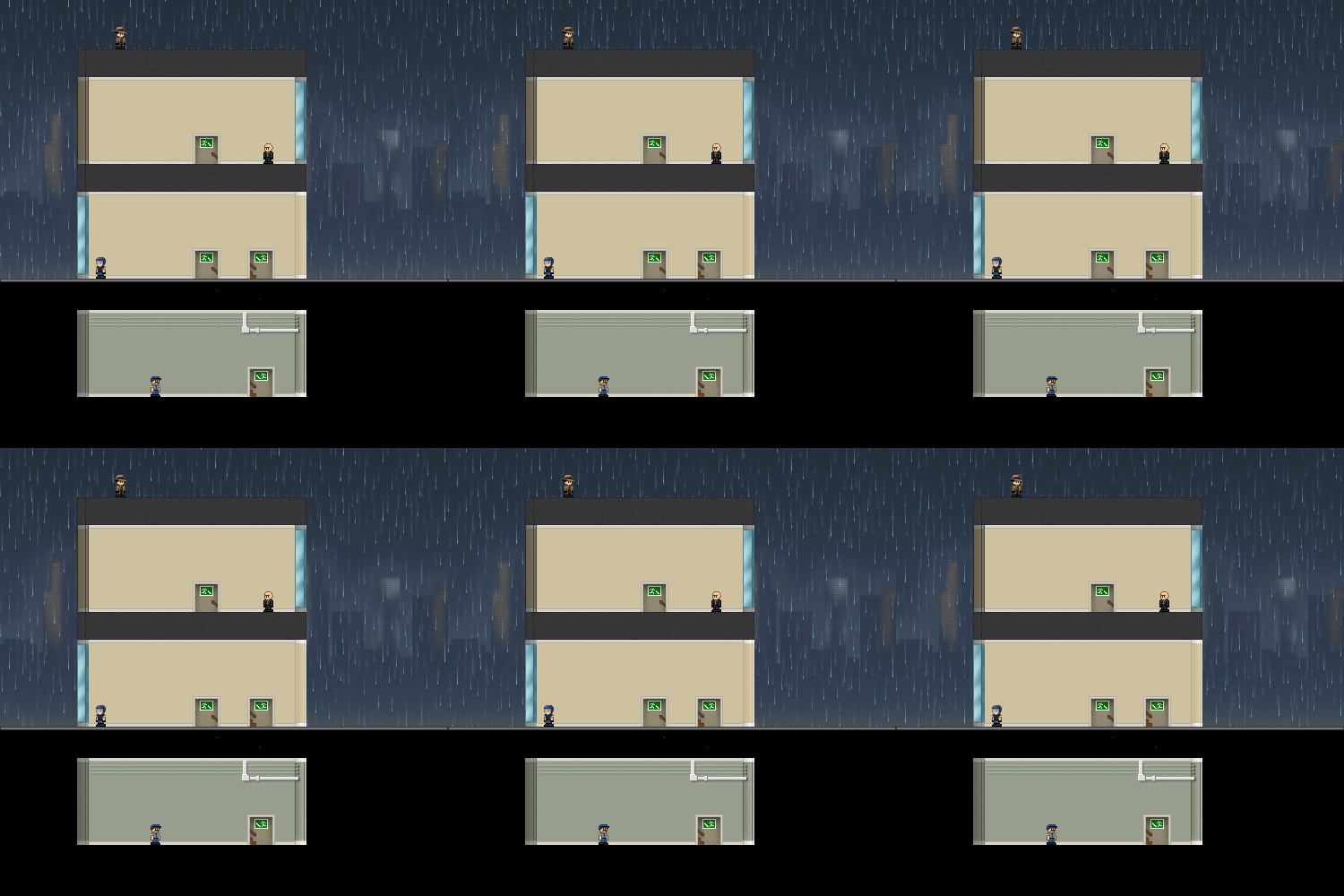
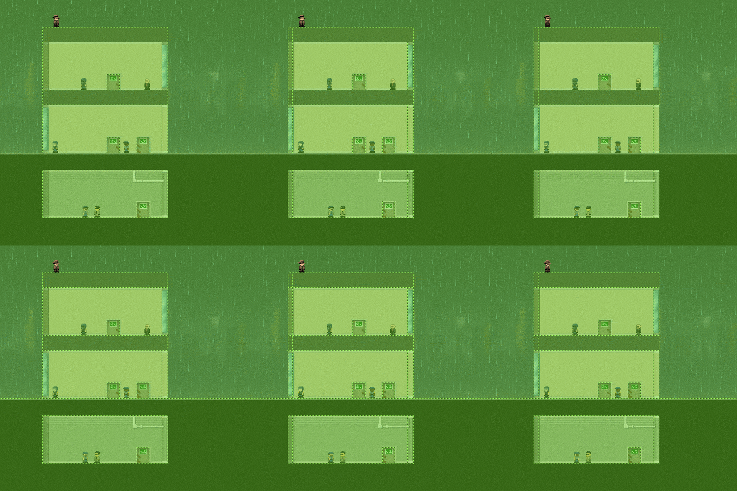
This means the people in Gunpoint are going to look a bit like this:

We’re going to have a chat about it, try some things out, and tweak all this until it fits together nicely, looks clear and readable, and makes you really want to play it. At that point I’ll try to pull it all together into a first proper screenshot so you guys can see what the game’s going to look like.
I’m not kicking into proper “Woo, look at my game!” mode yet, but I have set up a Twitter account: @GunpointGame, to talk about the development, make programming jokes, link other indie dudes I think are cool, and ask you guys for opinions on how some things should work. I’ll also be putting out future calls for testers on there – not sure when the next prototype will be yet.
As you’ll see from the first tweet there, I’ve now got every feature I want in Gunpoint working. This is the fundamental stuff, like:
- Branching conversation trees with player choice
- Mission select menu where new jobs unlock depending on your performance and experience so far
- A shop system where you can buy upgrades and equipment
- Stats that track your performance in a mission so the client can react to how you dealt with it
It doesn’t mean I have the pause menu done or anything looking good, but the full skeleton of the game is there now. The plan for those elements has stayed steady for a long time, but it feels a lot more concrete now I know they all work.
Once we know what we’re doing for the art, my next job is making all the levels. Which means knowing what the missions are about, which means knowing the objectives, which means knowing the clients, which means knowing the key players and their conflicts and characters, which means basically coming up with the story. I’ll put up another post about that probably tomorrow, because I’d like your advice on how to make it not suck.
Lastly, I was interviewed over at Laser Romance, about stuff like why Gunpoint is no longer about a murderous space robot.
As mentioned there, Gunpoint now has a proper URL if you want to link it anywhere: gunpointgame.com. It currently just shows you all the posts here tagged with Gunpoint, but I’ll eventually make it a bespoke site. Incidentally, if anyone knows how to make only posts in the Gunpoint category appear at https://www.pentadact.com/gunpoint with WordPress, I’m having a hard time figuring it out.
Gunpoint’s Possible Art Styles
It’s humbling and overwhelming to have a bunch of talented people throw stuff at you. Content-wise, I mean. I’ll stop gushing about it now, though, and just show you the best of what I’ve seen. Sorry to anyone who submitted stuff that isn’t featured here – I have the enviable problem that to feature everything would actually grind development on the game to a halt, so I’ve had to be more ruthless than I’d like. I’ll split this into Character art and Setting concepts.
Characters
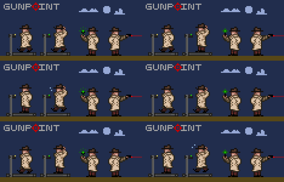
EthZee’s main character mockup is exactly what I was hoping to get – something not a million miles from what I’ve got, but correctly proportioned, nicely shaded, and animated. I love that he used treadmills to explain why the walking and running animations stay on the spot.
Michael’s stuff is amazing. It puts me in mind of some sublimely quirky French adventure, full of excitingly atypical characters. I tried to see a way it could gel with the mood and feel of what I have in mind for Gunpoint, but I couldn’t. I really hope he can use this guy, and the others he made in a similar style, in a future game.
I particularly love Teck’s second take on the hero. It’s based on a sprite he did of Mal Reynolds from Firefly, and it’s awesome that even at this resolution, you can kind of tell.
I am scared of this. Definitely one of the most original takes on what the character could be.
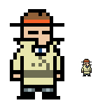
Dan, an artist at Bizarre Creations until they went under, did the awesome sprite above in the comments here just for fun. He can’t actually do the art for Gunpoint since he’s busy applying for jobs, but he had a go at reducing it down to the 24px size of Gunpoint’s other characters anyway, and it’s somehow even cuter.

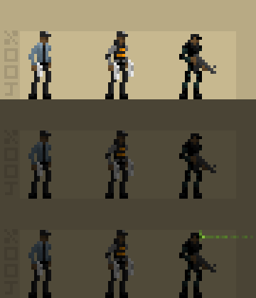
The sprite above is the first thing John sent, his take on the ‘professional killer’ enemy type with an android twist (I hadn’t set out my full specs for the setting at the time). It’s one of the rare pieces of art that, even in isolation, just makes me think “Holy fuck I want to play that game.” I’d be this guy, I’d fight this guy, I don’t care, I just want to be playing around in a world with things like that. The guys below that are what the more conventional guards would look like: lean, capable, cool.
Eric’s a professional who’s worked on a lot of big licenses, which might explain why his version of the player character does such a perfect job of capturing what I was trying to do with my original art. I tried to do something cartoony in style without being silly, and that’s exactly what he’s pulled off.
If there’s ever a Nintendo DS version of Gunpoint, this is definitely what it should look like. I like the cleaness.
A great character, a little smarter than the Columbo-like slob I was imagining. I can picture him jabbing someone with his umbrella to release a slow-acting poison, and that’s a quality I like in a sprite.
Setting
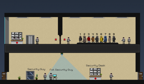
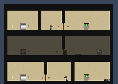
Great to see a complete take on it – some of the things I don’t like about my placeholder stuff, like the beige walls, actually look fine once there’s some well-drawn detail in there. Glass-backed elevator is a cool idea.
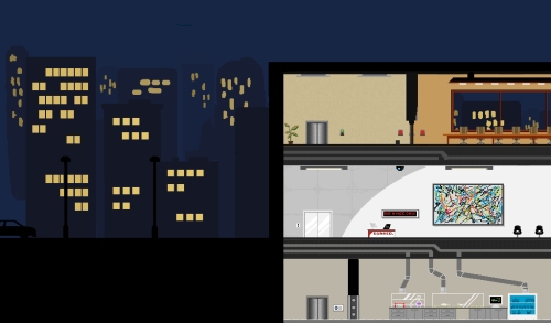
A nice selection of interesting environment types here – I think big windows facing out onto the city are a must, and I really dig the giant Pollock in the modern-looking office below.
This is about as clean, clear and cute as the game could possibly get – I don’t have to magnify it, or even really open my eyes, to see every detail. The cityscape is lovely, as is the sparkly rain, and the whole thing has a nice cohesiveness. I can’t quite figure out if the mood of the game would clash with just how adorable these guys are.
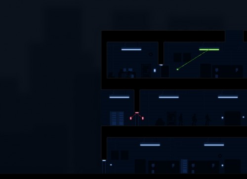
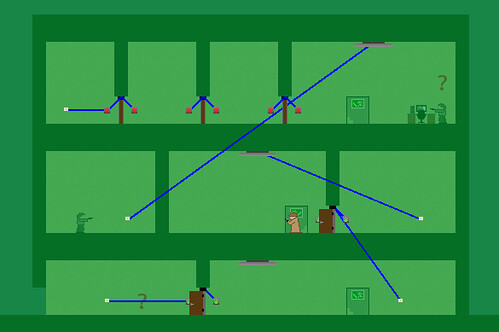
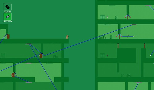
If you ask John (who did the awesome trenchcoated android) if he’s interested in doing any environment art, this is what you get back the next day. It looks like a finished game. An amazing amount of detail – the cleanness and bursts of colour remind me simultaneously of Aperture Science and Mirror’s Edge, which is sort of saying something. Click through for the bigger versions of these. The Crosslink mode is so much cooler than the way I imagined it, making it something you’d be excited to switch to rather than an ugly but necessary mess.
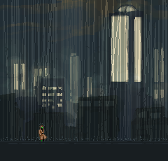
Such an amazing city backdrop. Has the gloomy, ominous mood I was going for, but is also just slightly futuristic and strange – these tall lit towers are unusual architecturally, and it gives the place an intriguing atmosphere that makes you want to explore it. I’m so set on rain being a big part of the atmosphere on some levels that I’ve been thinking of having varying strengths of it – it’s such an easy win on the audio side, and if heavy rain can look this cool, it’s definitely worth it.
Despite the ridiculous level of talent here, I’m pretty close to a decision. I’m just waiting on a couple of samples to see how certain styles work with certain elements, and I’ll know once those are in.
In the end, it’s come down to style much more than quality – quality just isn’t an issue when so many are so good. Any of these styles would make an awesome looking game, so I just have to go with whoever happens to click with the style and tone of the aspects of the game I’m doing on my end.
Gunpoint: The Setting
Wow. Response to my badly made video has been crazy, a whole order of magnitude more positive than I’d hoped. Actually slightly nervous now.
The best result of this is that a whole load of really talented people have offered their services, and many have already done great samples. There have also been a lot of very reasonable questions that made me realise my last post didn’t adequately define what I’m after. I called the current art a ‘rough guide’ without saying what about it should guide and what should be ignored.
So here’s a bit more about the idea for Gunpoint’s setting, look and mood.
World
Gunpoint is set in a big, largely empty city – or at least a largely empty part of a big city. It’s only about 20 years ahead of present day, so most technology is the same.
You
You’re a freelance spy. You get jobs from a site that lets agents choose from briefs written by anonymous clients. You wear a long coat and hat, and because you’re a spy, I would rather your face is either not clearly visible or has no recognisable features.
You’re the sort of person who acts very relaxed until he really needs to do something quickly, at which point you’re a flurry of motion and then back to trying to look nonchalant. I haven’t finalised your movement yet, but there’s a chance you may need to go from a casual shuffle/saunter/mosey into a semi-urgent run as you accelerate.
Gadgets
Through the agency, you buy a few rare high-tech gadgets to help with your work.
Hypertrousers: I always forget to tell people about the Hypertrousers. Compressed air actuators let you jump ridiculously far.
Gluon gloves: let you climb on any wall or ceiling. Adhesion does not actually use gluons. Gluon is a trademark of GluCorp and quantum physics is now a patent violation.
Crosslink: lets you connect any two electronic devices so that one triggers the other. Actually a cheap, widely available app for your phone, but so poorly marketed that only a handful of agents know it exists.
Tone
I want Gunpoint to have laughs, but it’s not set in a crazy world of whacky characters. People die suddenly and undeservedly, there are truly nasty people about, and justice is not always done. If you’ve seen Kiss Kiss Bang Bang, that’s the kind of tone: there are funny people in it, but they’re out of their depth in a dangerous underworld.
Look
Every mission takes place at night. It’ll also rain a lot. The main visual motif is meant to be the warm orange glow of a lit office block in the cold blue of a city at night. I have done a pretty lousy job of capturing that.
People
I’m fairly easy about style, but guards shouldn’t have too much individual personality, because there’ll often be a lot of them on screen at once.
The main restriction is that people have to be between 20 and 30 pixels tall. I said before that they could go over 24 if it’s part of a whole makeover for the scale of the game, but looking into it, even a makeover wouldn’t work with a 50 pixel tall character. Here’s the problem:
It’s nice and clear, but where the hell is my jump going to land me? The character needs to be small so the jumps can be big. And I want Gunpoint to work on a typical netbook res, 1024×600, all the way up to 1920×1200. The art challenge is to make a low-res character clear and appealing.
Thanks so much to everyone who’s put effort into the awesome samples I’ve seen so far. They’re giving me ideas already, so even the ones that don’t go in will have an effect.
Let Me Mumble You Through An Early Version Of Gunpoint
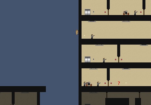
The game I’m making, Gunpoint, is an infiltration game that lets you rewire its levels to mess with your enemies. It is ugly and has no animation.
I’ve learnt to do a lot of new things while making this, but art always takes me ten times as long as it should, and ends up… well, look at it. So I’d like to find someone who’s willing to help out with the visual side, particularly with animating the characters. There are only a few, it’s pretty simple.
In case anyone is interested, I thought I should talk you through what the game’s actually about so you can see if it’s something you’d want to be involved in. And for everyone else, I’d just like to give a better idea of what it does. I will probably regret this.
Here’s me, talking you through a very early prototype of the game as I play it. This is also my first stab at making a video, which is why it’s barely visible at anything less than 720p, everything’s tiny, I’m really quiet and the game sound drowns me out a few times. Enjoy!
The e-mail address is pentadact@gmail.com. Let me know what you think in the comments, and fling the link around if you found it interesting. This is a lot more than I’ve shown publicly before, so I’m interested in whether it seems appealing.
If you’re interested in chipping in with the art
Update – I no longer need help with the art!
The catch is I can’t pay you – I’m making this in a small portion of my free time, it’ll be free when it’s done, and my budget is zero. So I’m looking for someone who wants to help out for fun, practice and experience.
I’d love to see what you want it to look like. You don’t have to have any experience or qualifications, but if you could do a mockup of one character and their walking animation, that would be awesome. You can post it in the comments here or e-mail me.
Characters are about 24 pixels tall currently, but you can stray from that if you want to give the whole game a makeover – all the level objects and stuff.
There’s a pretty good chance no-one’s going to be up for this, in which case I’ll just do it myself once the rest of the game’s done, but it’s worth asking. I’ll still finish it, it’ll just be later and uglier.
The art that’s in there right now is a vague guide at best: I want the main character to have a long coat and a hat, but everything else is up to someone with actual ideas in their brain. The guards aren’t supposed to be grey – this guy was originally a deranged civilian but I cut that role.
To be clear, here’s what’ll ultimately need doing:
- Walking, climbing and ceiling-climbing animations for the main character.
- Walking and running animations for guards, armoured guards, and professional killers.
- Walking and running animations for some kind of civilian dude, and slight variations of him.
- A few miscellaneous combat interactions.
- A bunch of stuff I’ve forgotten.
- Optionally, any environment and character art you can improve on. Lord knows it sucks right now.
The very loose time frame is about two to three months. The game may end up taking longer than that – I’d like to have it out by the end of July, but even that’s not a hard deadline. Yay development!
How I Am Working
Gunpoint is going amazingly well. I’ve been splitting what’s left to do into little monthly task lists, and I’ve already finished everything I had down for March. I started making the game in May last year, and said I didn’t want it to take more than a year. So my aim is to release it this May. Expect it in July.
I typically only work on it about one weekend a month, and I forgot about it completely for two months last year. The two days I spent on it during the holidays shot it forwards to a really exciting point, and the feedback from testers on that version was amazing. So lately I’ve been spending about a third of my spare time on it – what we in the lazy industry call ‘crunch’. Continued
Gunpoint: The Mechanic
The game I’m making is about infiltration, but I’ve held off mentioning the way you do it until it’s actually in the game. It is now, and on Saturday night I sent it to around one hundred testers who kindly agreed to try it out. This was a little nerve wracking.
Before I go any further, if you signed up to test the latest version but haven’t played it yet, I’d really like you to play it before you read this. The reason I haven’t mentioned it before is that I wanted the first people to play it to do so fresh, to see if it makes sense without any external explanation.
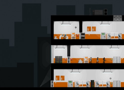
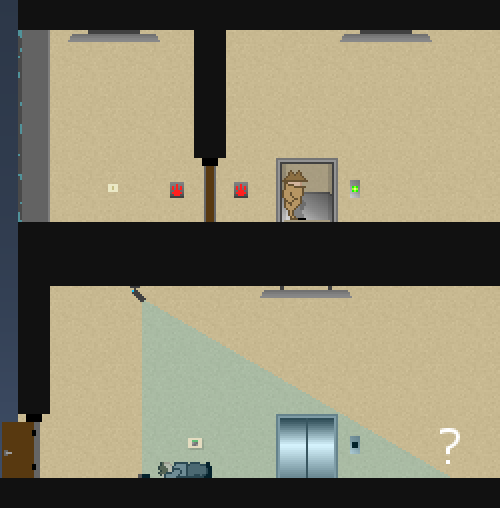
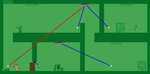
It’s a tool called the Crosslink, which lets you rewire any device in the level to any other. So if there’s an electronically locked security door you want to open, you can use the Crosslink to wire a light switch to it, then press the switch to open the door.
But you don’t have to be the one who presses the switch: guards will use security hand scanners to open those doors, and hit light switches if they find themselves in the dark. So you can rewire those things to screw with them: a guard tries to turn the lights back on and finds it slams a door shut and traps him in the room. Trying to open it unlocks another door halfway across the level, letting the player into the building.
The idea is to give the player a lot of freedom to tinker with their environment and fuck with people. I wanted a system that gives you enough power that you can be creative, think of approaches that I hadn’t considered, and come up with your own way of playing. And I wanted a game where killing a guy is not the most interesting thing you can do to him.
Games that funnel you down a single path seem to be made from a perspective of, “What if the player is stupid? How can we make sure he can complete this?” I wanted to start from the question, “What if the player is smarter than me? How can I make something even he’ll enjoy?” I still want the barrier to entry to be low, but I don’t want it to double as a ceiling on the intricacy of what you can do.
The results are making me very happy. I built a crude demo record/playback function into this prototype, so testers can send me a replay of their first attempt at the game, and I can watch how they dealt with each level. My plan was to see where the stumbling blocks were, what players tried to do but couldn’t, or didn’t try but could have. But it also shows the awesome solutions they came up with.
In the last one I watched, the player seems to rewire a building all wrong. I’m scratching my head when he hits a lightswitch, which isn’t connected to anything more interesting than a light. But a guard on that floor is by another switch, which he hits.
Instead of turning the light back on, it turns off the light on the top floor, causing the guard up there to open several security doors on the way to turn it back on. When he finally presses it, instead of the light coming back on, the door slams and locks behind him. The player just shuffles up the stairs and hacks the terminal he was trying to get to, while every guard on the level is trapped in a different darkened room.
That’s not the quickest or easiest way to do that level, nor one I’d ever tried, but it’s awesome to see people come up with their own plans. Early on, I’m happy for them to do that in a sort of sandbox context: it’s not necessary but it’s fun. Later on, I want to complicate the mechanic slightly so that this kind of ingenuity is actually necessary – putting devices on incompatible circuits so you have to trick the AI into bridging the gap for you.
Before I started thinking about this stuff, Irrational Games’ Steve Gaynor posted a great analysis of what leads to emergent game experiences. His conclusion is that meaningful state change is at the heart of it.
I totally agree, but I also wanted to come up with a more comprehensive list of the elements that make a game like Deus Ex so endlessly entertaining to me. Whether you want to call it emergence or something else, I decided on the components a game needs to have that kind of excitement:
1. State change. I must be able to change the state of important elements of the game between more interesting conditions than ‘alive’ and ‘dead’.
2. Connectedness. Elements should be able to affect each other, not just me.
3. True obstacles. The most direct and simple path cannot be viable, at least not for the ideal outcome.
4. Significance. Some elements must be obviously powerful, valuable, or consequential.
I’m satisfied I’ve covered 1 and 2 in Gunpoint now. 3 is sort of in there, in that you can’t open most stuff directly, but the simplest Crosslinks are usually viable solutions right now. That will change when I make incompatible circuits. 4 is less nailed down – it might come in the form of your objectives, VIPs and the like, it might be to do with the cops or rival agents showing up, or it might just be about guns and who has them.
The nice thing about the Crosslink mechanic is that it adds a lot of value to whatever else I put in, so it’s easier to justify spending some time on a new device. I’m always open to ideas for those – I’m planning some kind of metal detector or security camera, something triggered merely by presence, and an alarm that’ll summon guards to a particular floor when triggered. Any others?
Gunpoint: Tripping Up
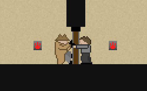 Okay, so neither of us have quite mastered the door technology yet.
I’ve gone back to working on the infiltration-themed platformer I’m making, Gunpoint. I’d planned to take two days out of the winter break to binge on it, but after a few interruptions I’ve decided four half-days might be more doable, and less exhausting.
The plan is to rapidly impliment the last few features it needs before the main mechanic can make sense, without slowing down to fine tune their operation or tweak the look. So far I’ve got security doors and light switches working, and I’ve almost got the AI interacting with them correctly: only guards can pass through security doors, and they’ll turn on lights if they find them off. Next it’s the main mechanic, then a few last fundamentals that may end up being important.
It’s fun to be making fast progress again. It was a huge mistake to bother putting elevators in before the rest of the basics were working, and the ridiculous time that took added to the ridiculous time AI took is the main reason I ground to a halt on the whole thing.
I now have a game that is ugly, broken and crude in every way except the lifts, which are the most magnificently smooth, reliable and satisfying vertical transportation in the history of interactive entertainment. And I’m about one month behind where I would have been if I’d stuck to stairs. It started to feel hard.
It isn’t, really, but a few things do trip me up repeatedly. I want to make a note of them here on the offchance it gets any of it through my skull, so the rest of this post will make no sense to anyone who doesn’t use Game Maker (the tool I’m making the game with).
Things I Wish I Wouldn’t Constantly Forget
- When you store an instance in a variable – remembering which wall I’ve just collided with, for example – don’t. Store its .id property. Sometimes, even though what you want to reference is a property of that thing, you have to pretend it’s a property of that thing’s id, even though that makes no sense. Otherwise, you get shit like light switches that toggle their own existence on and off instead of changing the light level.
- The Create event is a handy place to put any code that should be executed when the object is created. DON’T EVER FUCKING USE IT FOR THAT. Why? Because the objects in the game at start up are created in an arbitrary, unreadable, undeterminable and randomly changing order.
You have no idea what code has already been done and what hasn’t when any given Create event is executed. So when one tiny change to something suddenly breaks everything in your entire game, including a bunch of stuff it had absolutely nothing to do with, it’s because the Creation order has changed arbitrarily.
Only ever use Create to set initial variables, then use Alarm events to trigger actual code. That way you can set those alarms to go off in the order you specify.
- Often you want one object to ‘trigger’ an event for another object. The reason the method you just tried isn’t working is that it’s getting re-triggered repeatedly sixty times a second all the time that the conditions are fulfilled, usually reversing the effect and/or delaying alarm events indefinitely.
The best way I’ve found to do triggers like this is to have it set an Activate property on the target object. The target object checks this Activate property every step, and the moment it’s ‘true’, it sets it to false, does its work, then tells the trigger object not to bother it again until it needs to.
- Relatedly, attach code to the object it affects, rather than the object that executes it. A button shouldn’t open a door, even if that’s the only thing it’s ever going to do. It should just say “Open!” to the door, and the door itself should contain the code for how to do that. That way, if you ever need other objects to open the door, they can just say “Open!” too and it won’t cause any conflicts or require any repeated code.
Pretty goddamn fascinating, I think you’ll agree. The truth is that most of the problems you encounter creating a game aren’t as frustrating as playing the average shooter. You don’t expect to succeed. You’re wrestling a ridiculous tangle of logical statements into something that functions as a comprehensible world, which is an insane and extraordinary thing to do – even when the results are drab, glitchy and artless. In other words, I’m enjoying it again.
By the end of this sprint I plan to at least be able to show you a video of it in action, and possibly send out a new prototype version to testers. If you’d like to try it when the next version’s ready for testing, and haven’t already mailed me about it, mention Gunpoint in a mail to pentadact@gmail.com.
A Two Hour Patch For My Two Day Game
I’ve just put up a new version of the game I made last weekend, Scanno Domini. You encounter randomly generated enemy robots, scan them to unlock their parts, then kill them and take all their guns, shields and engines for yourself. Grab the new version here.
If you do play it, I’d love to know what you thought of it – I’ve been really surprised by the feedback so far.
This version fixes a few significant bugs I didn’t have time to test during the compo – the competition version will stay as it is for judging purposes, of course, I’m just putting this up for anyone who wants to have fun with it. The key changes are:
- Choice of resolutions – anything up to 1920×1200. The game will remember your choice and not ask you again.
- Fixed a crash relating to being able to fire while dead. Duhhh.
- Fixed a bug preventing enemies from sensing when you shoot or touch them – they now turn to try and find you.
- Fixed a lot of erratic behaviour with the scanner – it’ll now scan all the new tech the bot has in one go.
- Fixed a problem with bot behaviour that made The Ominous Event extremely hard to recover from – they’ll wander off on their own once you’re down now.
- Fixed a bug causing some bots to spawn ‘blind’, with no vision cone. It was kind of cute, but causing problems down the line.
Sometime after Christmas, I think I may try a 48 hour sprint with Gunpoint. Getting so much done in such a short time is exhilarating, and it could really use a burst of progress to get it to a point where it makes sense.
Ludum Dare Day 2, 1:55AM: Done
Jeeesus. Five minutes to go, and my game is zipped up and submitted. Grab it here. Feels strange and amazing to be ‘done’ with something – I’ve tinkered around with games for months without getting to a point I’m happy with. And while there are a few items not grayed out on my Scanno to do list, I did much more than I ever thought I could in two days. And I actually have fun playing the result.
Rather embarrassed about Gunpoint now. It could probably be done in a week.
The finished game is pretty much what I planned: a top-down shooter with randomised enemies, whose randomised bits you can steal for yourself. I didn’t end up scaling much dynamically, except the gun sizes. I couldn’t find a way to make it look right in the time, so it was quicker – even for me – to draw a few engine and weapon types. The differences are more immediately interesting, too – “Ooh, blue plasma?”
Number one thing that went right was definitely time management. I had two days, so I picked something I thought I might just about be able to do in one. It was done in one and a half, so I had that crucial half day to take a working concept, find the fun, and make the game about that.
I don’t know if I actually made it fun, but it’s so much closer than it would have been if I’d picked a more ambitious idea and only just got the basics hammered out. This is my first finished game, and given the time limit I thought I’d end up with something a lot more half-baked.
It is buggy, and its tutorial is just gibberish, but in an ideal circumstance it’s conceivable that it could convey to you what you need to know. Oh, except that you have to press R to restart.
Thing that went least well was trouble shooting. I’m rarely good at this, but on the scanning ray in particular I just went out of my mind. It’s still buggy – won’t always scan everything there is to scan on your first scan – and I may have messed up other things in the last minute fixes.
I said I was going to leave graphics till last, but in the end I decided it was worth a stab at them if I gave myself a hard time limit. I basically managed to turn the visuals from offensively ugly to merely very crude. I’m OK with crude. There’s just a particular look to very bad graphics that’s not endearing or ignorable or in any way OK, and I had to try to avoid that.
I also took time to put in sounds for almost everything important, and I’m really glad I did. I knew they’d be important to the feel, but I didn’t quite appreciate how important the feel would be to the overall thing. It’s not an art game, it’s not very brave or inventive, so it really needs to have some decent ‘pew pew!’s in.
I have exactly no time tomorrow to polish this up and also submit it to the jam, the less strict contest that gives an extra day. Which is a shame, because it needs a few bandages to hold it together properly, and a few basic human rights like a choice of resolutions. I will do those things, just not right away. For now, I am done.
Thanks for all the comments, support and puns.
Ludum Dare Day 2, 1PM: Feature Complete
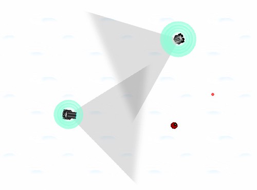
Which is to say: not graphics or content complete. So brace yourself for a painfully similar screenshot:
But the two tiny changes you do see represent pretty much everything else I needed to get done for the game to make sense: you can now scan enemies when they’re not looking to steal the details of their weapons, then use that info to rebuild their guns, shields and engines when they’re dead.
I’m happy I’ve got to this point, but there’s a lot more to do. I have a choice of a few fairly major areas to work on, and I’ll list them in my current priority order:
- Player guidance: Even in an ultra quick experimental game I don’t think this step is remotely skippable. If I don’t get a few basic tutorial messages in to explain how to play the game, no amount of readmes will ever make up for it.
- Balance: Bots of random strength spawn in random positions. So that kinda sucks. I just need a few lines of code to make weaker ones spawn near the player, tougher ones further away, and to make certain configurations excitingly rare. This’ll have a big effect on how much fun it is to play.
- Environment: I’d like to add water around the edges to make this an island, and possibly a fortress wall at the top.
- Objective: Right now there’s no long term objective. Ideally I’d like to have you scanning and stealing parts until you’re strong enough to assualt a fortified wall to the north and escape.
- Graphics: I must at least make some proper plasma blasts, and ideally add explosion effects and a better player bot. I also need to take one more go at making snow look less awful – I’d like to make it grainy and randomise the ‘dunes’ a bit.
- Extra feature: scale. I’d really like to have double- and half-size bots roaming around, with accordingly different toughness and speed.
The reason graphics is so low is that the time it takes is such a wildcard – sometimes I get something bad right away, other times it takes me hours to make something bad.
Let me know if you think my priority order is nuts.
Current title idea: Scanno Domini. Other scan puns welcome.
Ludum Dare Day 1, 11PM: Almost Fun
The screenshot I’m about to show you won’t look spectacularly different to the one earlier – I still haven’t fixed the horrible protagonist bot or the laughable kid’s snow effect. But to play, it’s already close to what the finished game will be.
The main thing is randomised enemies, with visually apparent stats. Randomisation will be part of the Discovery element, and also just the fun of the game: it’s never going to be a great shooter, but it’s already kind of cool to blunder into a triple-barreled deathbot with hyper speed and discover a whole new echelon of boned.
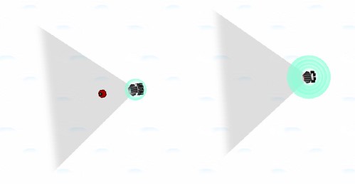
The visual apparency – representing every stat in the shape of the enemy rather than a stats readout – is part of that too. It gives your read on the enemies immediacy, and that’s a catalyst for fun. I need all of those I can get. Hopefully you can tell which one of these enemies has more firepower, and which one is better protected.
What you can’t see, and what you probably won’t even find if you play it, is the ridiculous amount of fun I’m having with it.
Most of this afternoon was spent thrashing out the enemy movement to be more convincing and dangerous, and all of this evening was spent drawing just a few bad sprites – it takes me actual time to get pixel art to the dismal level of quality you see here.
Then in less than half an hour, I did the coding legwork to implement every chunk of art into modularly assembled, dynamically scaled, randomised deathbots. And the game’s gone from being a tame arena where I can always win through knowing the tricks, to a terrifying robot safari where things with crazy muzzle velocities can also outrun me, and I see combinations I hadn’t pictured.
It’s not exactly good, yet, but it’s an amazing thrill to see that kind of stuff come to life from a few simple maths statements. I can pretty much stomach art work if it’s for a game that can stretch and recombine it to endless different purposes.
I’ve also had an idea for how to relate the game more obviously to the Discovery theme. It’s fun to try and creep up on these bots when they’re not looking. They turn round if you shoot them, to prevent the game being too easy, but I’m going to make it so that you can subtly scan them if you get up close and undetected.
If they have a module you’ve never used before, you’ll gain the ability to salvage it if you later kill the bot. And if they don’t, you’ll be able to read their robo-thoughts. Not entirely sure what I’m going to do with that, but even if it’s just an array of pointless introspection it should be fun to write.
Ludum Dare Day 1, 1PM: A Working Game
Two surprising things have happened: firstly, I’ve made a game that works already. There’s no point in playing it yet, since it does nothing interesting, but that was all I hoped to achieve today. This’ll give me time to make it interesting today, and make it good tomorrow.
Secondly, now that I’ve made enough of it to see what it’s going to be like, I realise it has almost nothing to do with the theme. The angry deathbots you meet aren’t randomised yet, but even once they are I think running into them is just going to feel like encountering enemies in an arena. It technically is discovery, but because they’re simply off-screen rather than visibly obfuscated, it’s not going to feel like it.
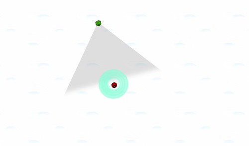
I’m not going to worry about that too much yet – my priority order is to make it interesting, then make it good, then make it fit the theme. Here’s what it looks like now:
The blue circles are shields: I didn’t fancy putting a bunch of work in just to recreate the conventional hitpoint bar or health meter on your interface, so I went for something more visual and in-fiction. Right now each shield takes one hit, but as you can see that makes you impractically large for not much health, so I’ll probably tighten their size and thickness before I’m done, and perhaps make them come back online a while after they’re taken out.
The enemy will have these as well, and they’re one of the things that’ll be randomised, so it’ll be very obvious when you’re facing something tough. Not sure if I’ll also have big hulls – that’d mean introducing an armour system as well, which may defeat the point of the shields.
I do plan to have large engines/tracks for fast bots, and a large turret or power core of some kind for things with a lot of firepower. Basically, if I can have at least three functionally important metrics that enemies can vary in, and make each one visually readable at a glance without any interface, I’ll be close to what I want.
Challenges right now:
- You’re in a fairly large open field of snow, and I’m not sure where to take the environments from there. I’d love it to be infinite but that’s technically tricky. I’d also love some randomly placed obstacles, but I’m wary of creating much art work for myself – I want time to redo the actual robots.
- My control method didn’t work: holding the mouse button to make your bot chase it was fun, but it meant you’d never be able to fire in one direction while moving in another. I’ve changed it to Cannon Fodder controls – click to move, right click to shoot somewhere else while you’re on your way. It doesn’t feel quite right with current movement speed and screen size – you’re at your destination before you’ve got more than a couple of shots off. May rethink.
- Random enemy movement was trickier than I thought. I’ve done it, but they’re rather geriatric: quivering with indecision when deciding where to move. I’ve realised the way to make it look better is have them pick an arbitrary direction, turn, then move. But that’s also the way every other game does it, so I’m still wondering if there’s a more interesting way.
Title ideas: Sighs of the Snowbots? Snowbot Snores?
