TOM FRANCIS
REGRETS THIS ALREADY
Hello! I'm Tom. I'm a game designer, writer, and programmer on Gunpoint, Heat Signature, and Tactical Breach Wizards. Here's some more info on all the games I've worked on, here are the videos I make on YouTube, and here are two short stories I wrote for the Machine of Death collections.
Theme
By me. Uses Adaptive Images by Matt Wilcox.
Search
Welcome To Site 7
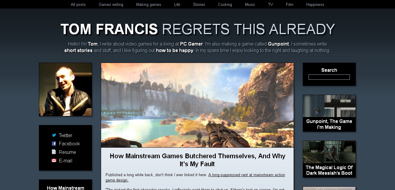
Look, I changed everything! I usually redesign my blog a bit at the start of every year, but this one is the first time I’ve built a completely new one from scratch in more than eight years. As is now tradition, I’ll give you a song to listen to while you snoop around. Continued
Welcome To Site Six
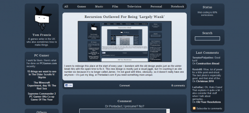
I seem to redesign this place at the start of every year – boredom with the old design peaks just as the winter break hits with the spare time to fix it. This new design is mostly just a visual jiggle, but I’m counting it as site number six because it’s no longer called James. I’m not good with titles, obviously, so it doesn’t really have one anymore – it’s just my blog, or Pentadact.com if you need something more unique.
I’ve sort of decapitated the old design:
It felt flabby and basic, and those black bars bothered me for no good reason. The new one fits more on the screen, and is a bit smoother. You’ll notice I’ve brought it bang up to date with the hottest web trend of 2003 – very slight gradients. A few other things are new:
- Infinite scroll: it loads the next bunch of posts when you scroll to the bottom. It doesn’t currently tell you it’s doing this.
- Like button: fucking Zuckerberg. That ugly little thing is so goddamn hard to put on any non-white page without making it hideous. I can’t resist them, though – they’ve been awesome on the PC Gamer site for letting us know the difference between pieces that people want to respond to, and piece people just… like. Without something filling that role, you never really know when you’ve done something right.
- Category tabs: browsing by category was a little obfuscated in the last design. I wanted to put them front and center for the sake of people who don’t care about games, since that topic often dominates this place a bit. Of course, which category link do the vast, vast majority of people click on? Games. They look at my site about games and think “Goddamn it, this isn’t enough about games! ONLY GAMES!”
As ever, please let me know what you think and if anything isn’t displaying right for you. I have some tweaking to do and presumably a lot of bug fixing, though it doesn’t look too disastrous so far.
Status
James was taken offline last week by my hosts, BlueHost, because something was spamming my database of posts incredibly rapidly with incredibly demanding data requests. It was using up so much CPU on the server that it was slowing down every other site it hosts.
I was in New York meeting a nervous walrus at the time, so I couldn’t do much about it. Now that I’m back I’ve looked into it, done some maintenance, taken some precautions, and asked them to put it back online. The upshot is that it seems to be fixed for the time being, but I’m going to have to keep a very close eye on it for a while. If it goes down again, I’ll post updates on Twitter here.
If you’re interested in the technical specifics, here’s what I found:
- A few lines of malicious code have found their way back into my source code, despite my having changed my password and kept up to date with the latest WordPress updates since that last happened. I’ve removed them and changed my password again, to something ridiculous. Not sure if there’s anything I can do beyond that.
- One visitor, presumably robotic, immediately started loading the same page dozens of times a second within a few minutes of James going back up. I’ve banned its IP, but I don’t know how to prevent that kind of thing in general, or why it would cause slow SQL database queries.
- Something was accessing parts of the database that aren’t supposed to be public. After careful investigation I discovered that, on this occasion, it was myself: when I accessed the database directly to do some maintenance, it was taking 6 seconds or so just to display or select the tables. Further back, there are still calls to these private tables that I can’t explain. I choose to ignore both these problems.
Thanks for sticking around.
James 2.5 Explained
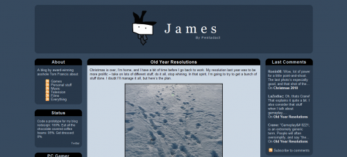
Welcome, to the all-new James! The partly-new James! The slightly-altered James! I’m calling it 2.5 – it’s the third redesign of my fifth personal site, but it’s not exactly a generational jump. I coded my first blog when I was fourteen, so I’m littering this post with embarrassing shots and links of the older incarnations. Sadly Archive.org only goes as far back as the first James, so the design marvels of, er, “Pentadact’s Site”, “Ugly Fruit”, “The Open Focus Network” and “Politics” are not on shown here.

Turns out I liked dark blue in 1999 too. And I took my tea black? Was I ever that young?
Very nearly changed the name this time – for a long time the prototype read ‘Pentadact’ at the top. There’s every reason to make that change, not least of which is that people might finally spot that it doesn’t have a ‘u’ in it. But no matter how long I left it like that it just looked wrong. This obviously isn’t Pentadact – that’s me. It would be like calling my house Tom Francis.
The smallest change is the new visual motif; that didn’t take long. In a weird way I hope making it narrower has made it look wider – when it greedily filled the whole screen, it had no shape or size of its own. Filling the screen used to be one of my design commandments – I loathe sites that cower in a column on the left-hand side of any reasonably-sized display. Now, I’m starting to see that there are readability reasons why ultra-wide isn’t always awesome, and I prefer sites with a sense of place to sites with a design philosophy.
Weird, news-style proto-meta-blog
The idea behind the stuff in the sidebars – which took all the time – is that as much as possible, it should be different each time you come. Almost everything is either automatically-updating, easy to update, or just randomised. Instead of a static set of dozens of nameless thumbnail shots of things, I wanted to actually explain what each thing is that I’m featuring. But for the number of things I want to feature, that takes a prohibitively large amount of space. So instead, the template randomly chooses two items and I attempt to explain what they are.
I also wanted to dredge up some older stuff occasionally – hence the At Random panel. Blogs are all about what’s new, my sites never were: I like to create a load of stuff and leave it all hanging there, like so much dirty laundry. I’ve read everything on this site at least twice, and I wrote all of it, but even I see things cropping up in that box that make me think “What the hell was that?” If you ever see it blank, by the way, click the Full post link and let me know where it takes you. Every post is supposed to have an excerpt, but I think one or two slipped through the cracks.
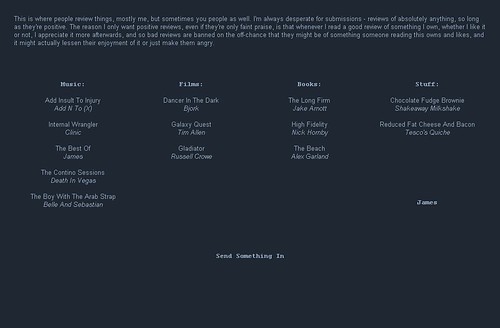
Apparently I actually had other people submit reviews and stuff to the first James. I invented Web 2.0?
It’s not supposed to hit you in the face or anything, but there is a logic to what goes in the left as opposed to right sidebar. Left is stuff by me or on this site, and right is elsewhereville, things by other people that I liked. The Favourites panel is a solution to the problem of distinguishing between the types of places I link. I don’t link anyone’s blog unless I read every post of it, but that doesn’t always mean it’s essential reading I want to push on everyone. I wanted a separate place for the stuff I truly couldn’t live without, and to give it a little love. It’s also the first thing I did, and trying to articulate why you like your favourite sites is not a bad way to start a blog redesign.
The channels at the top were supposed to be a bigger deal than they’ve ended up being. I thought that since virtually no-one is interested in everything I talk about, and since I personally stop reading a blog after one or two posts I wasn’t interested in, it’d be useful to be able to filter it by topic. Everything here does legitimately fit into one of those, and if you’re an RSS user you can subscribe to each of the ones you care about to get a sort of custom feed. Update: stats show people really like to click the word ‘Games’ up there. Knock yourselves out, chaps!
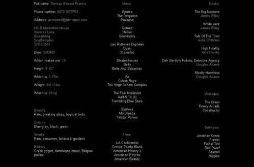
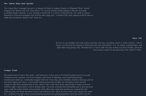
I was fond, perhaps too fond, of the left-centre-right alignment pattern.
The subscription stuff is technically not new, but I want to highlight it this time: RSS means new posts get sent to you rather than you having to check for them, which in turn makes me feel less guilty about erratic posting. Jason L’s already requested the ability to subscribe to the comments that get made here, so I’ve implemented that too. Google Reader makes the internet a single page that can be read by repeatedly pressing a single key: Space. So at last, we can start out-evolving these pointless limbs. I’m just trying to help that along.
And as you’ve probably seen, I’m embedding MP3s a lot now – I’ll also add a direct download link for them soon. I want to post more than just music, and I’m thinking of a new regular related to that. I have 1.5 terabytes of storage space now, and ten times that in bandwidth, so I might as well put it to use.
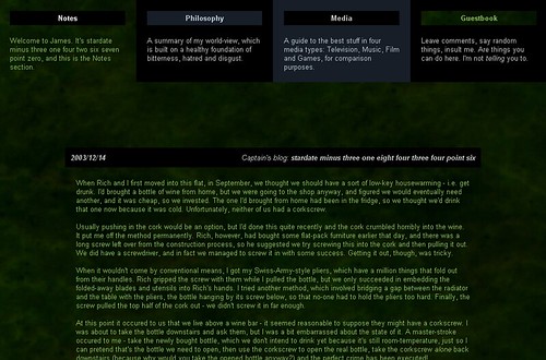
2003 – first recognisably bloggy incarnation. Hopelessly dark.
Oh yeah, the hosting: James was long overdue for its own domain, I got constant complains about the acronymic URL (good luck spelling this one, whiners!), and the real reason: my ISP now sucks so hard that I have to leave them as soon as I humanly can. A load of providers now owned by Tiscali are now getting horrible service as people are moved to cheap, shitty servers in a bid for the parent company to turn a profit for the first time ever. So that really filled me with the warm glow of consumerism.
I chose BlueHost because a hundred blog posts told me to choose AN Hosting. I don’t know if you know this, but there are no longer any objective reviews of this kind of thing – every major company offers a huge cash kickback to bloggers sending new customers their way. The most trustworthy you get are the minority who admit they’re being paid to recommend you.
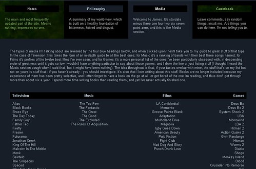
Holy shit I used to write a lot.
I almost went with AN Hosting anyway, but I happened to have their page up when I closed my browser for the day. It stopped me with a flashing alert claiming that a customer service representative for AN Hosting was trying to talk to me, and even lamely generated her (of course her) introductory lines. I almost spat. When I tried to close it, it generated another alert trying to panic me about that.
If these guys invent a cure for cancer, and I actually have cancer, they will still never see a penny of my money as long as I live, in cancery pain. BlueHost feel nice. Their CEO blogs. Their website lets you try out a dummy account. In fact, I like them so much I’m not going to link them, just so you know this isn’t a pay-per-post.
That would actually violate the prime directive of James, by the way, which is never to make money or sense.
